THRIV.
Together We Thrive

Invest in real business & thrive together
A design case study for a community-focused fintech platform that helps users discover vetted SMEs, invest confidently, track portfolios, and grow together.
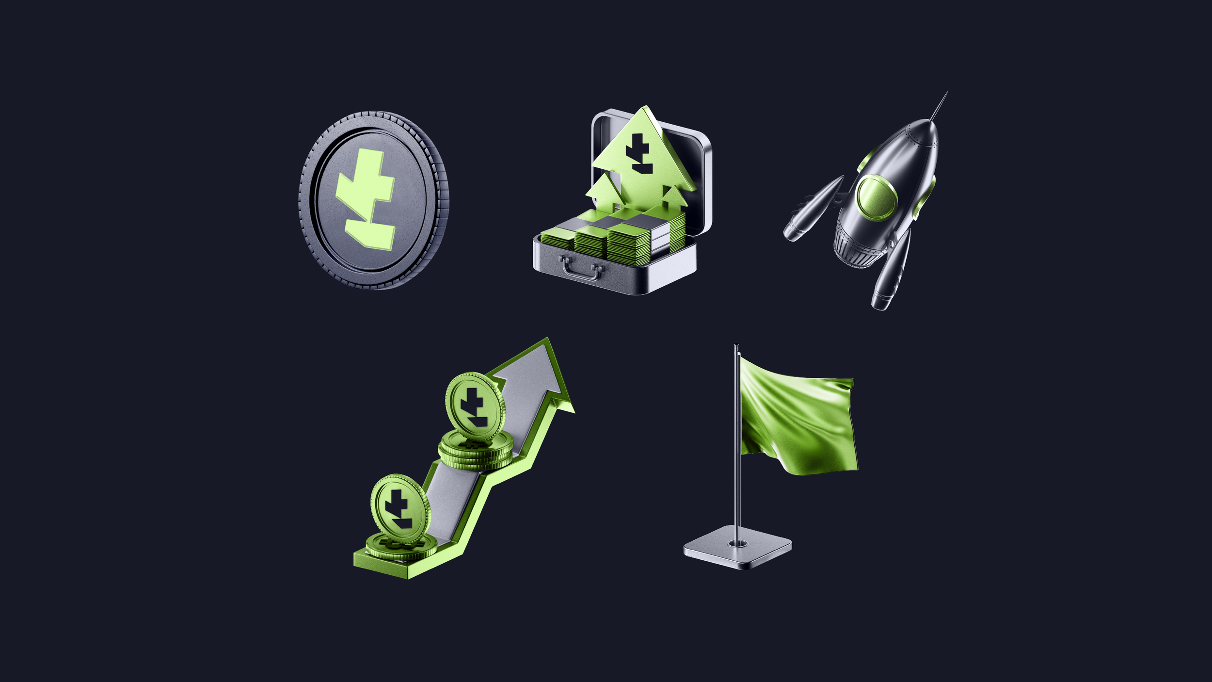
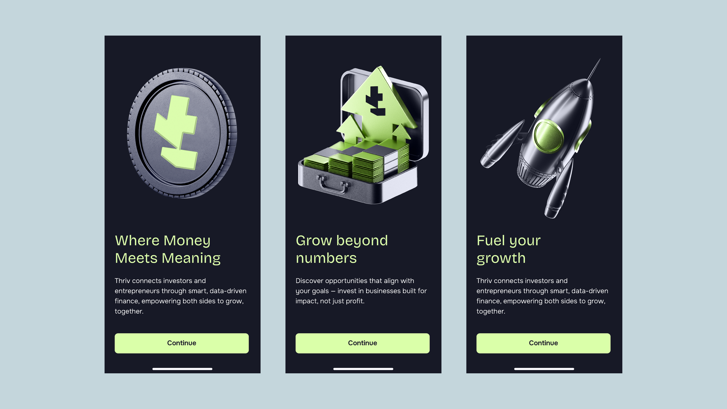
Grow beyond numbers
The Challenge
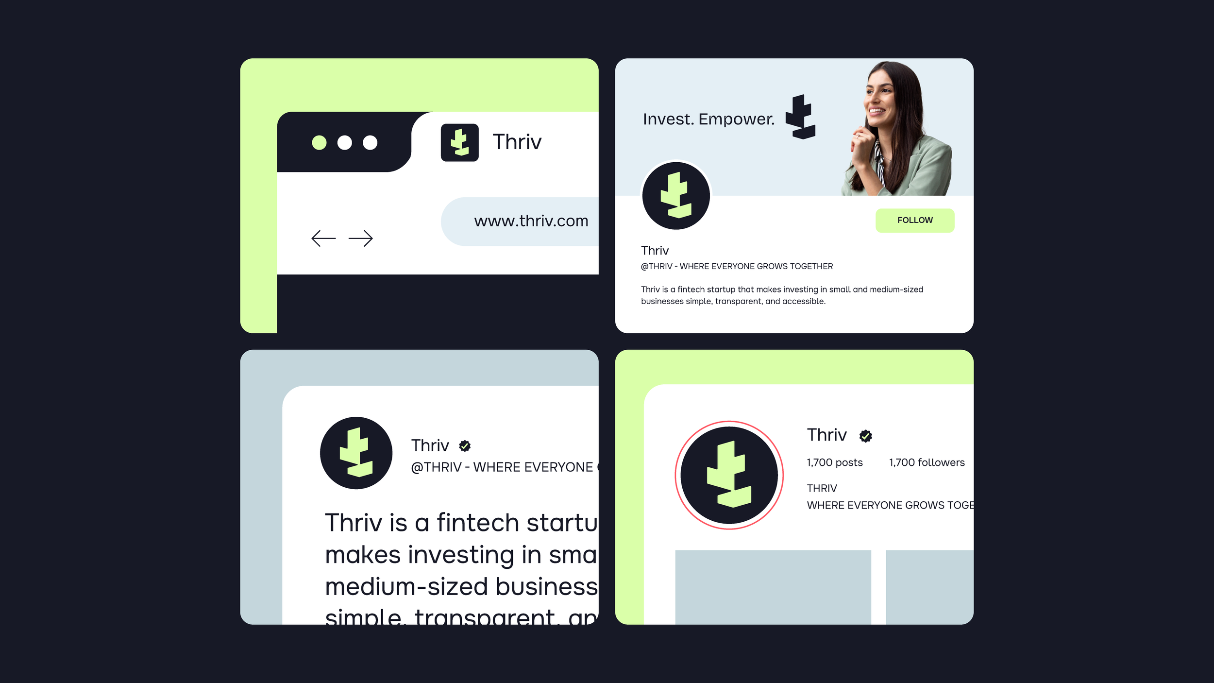
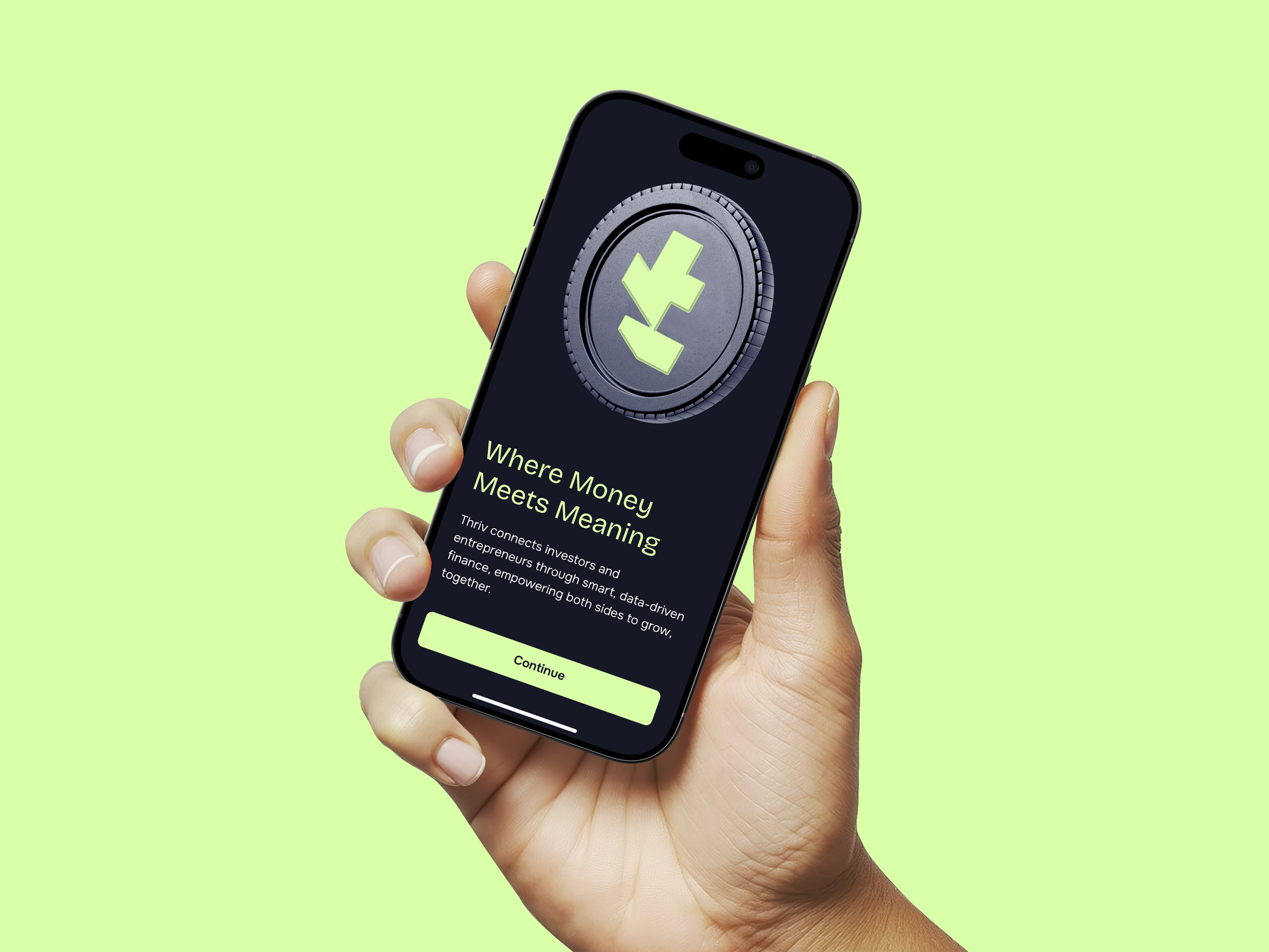
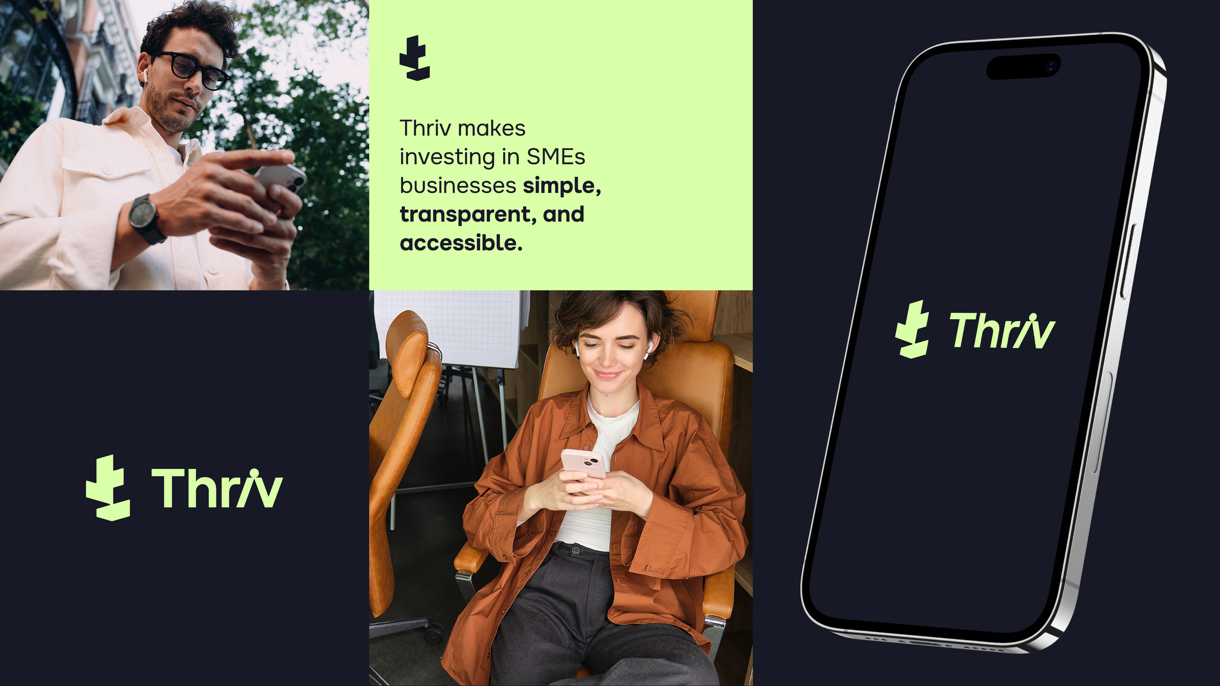
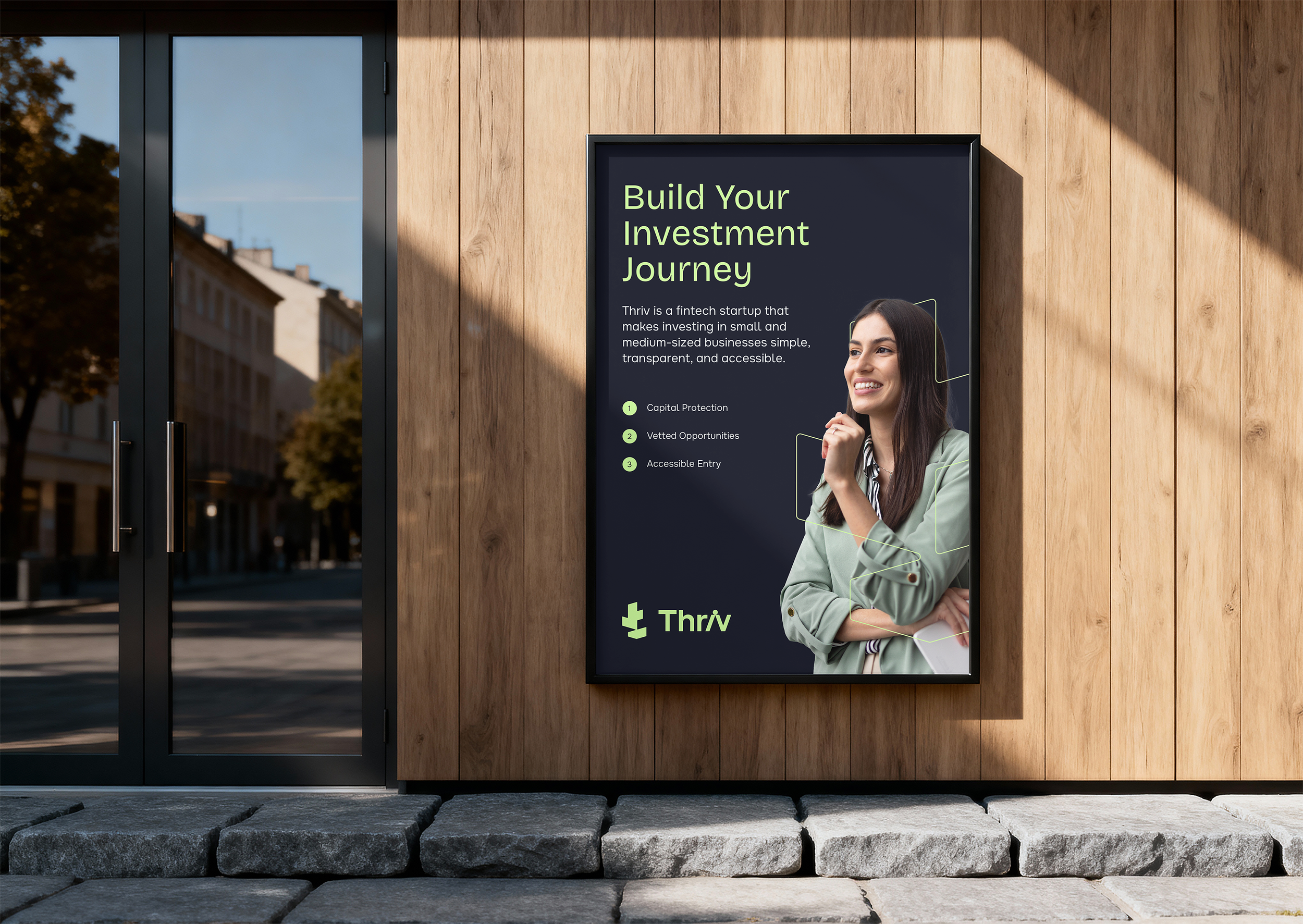
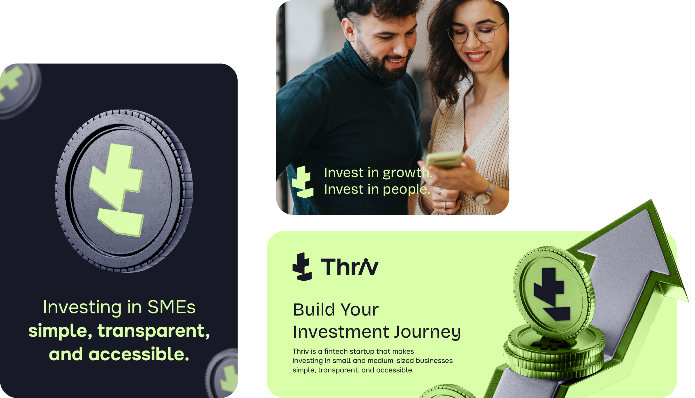
Thriv, an Egypt-based product app, connects everyday investors with real businesses, making investing simple, transparent, and accessible. Our goal with Thriv’s brand was to create a modern, trustworthy, and empowering identity that captures Thriv’s mission of making investment accessible to everyone, transforming it from something exclusive into something inspiring, simple, and human.
My Tasks
Branding Solutions
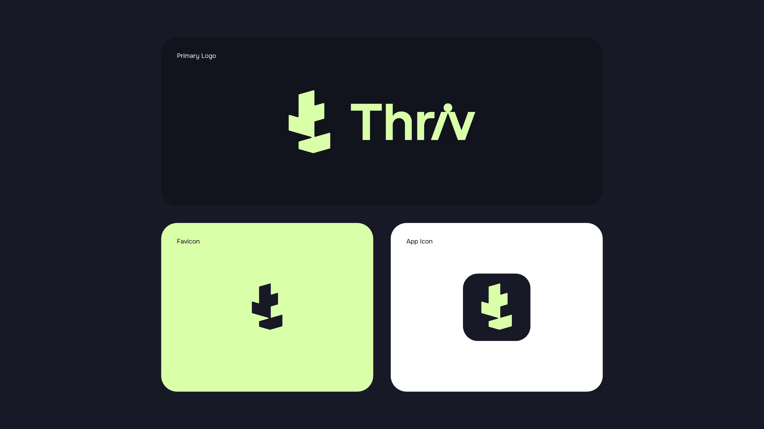
Logo & App Icon Design
Brand Identity Design
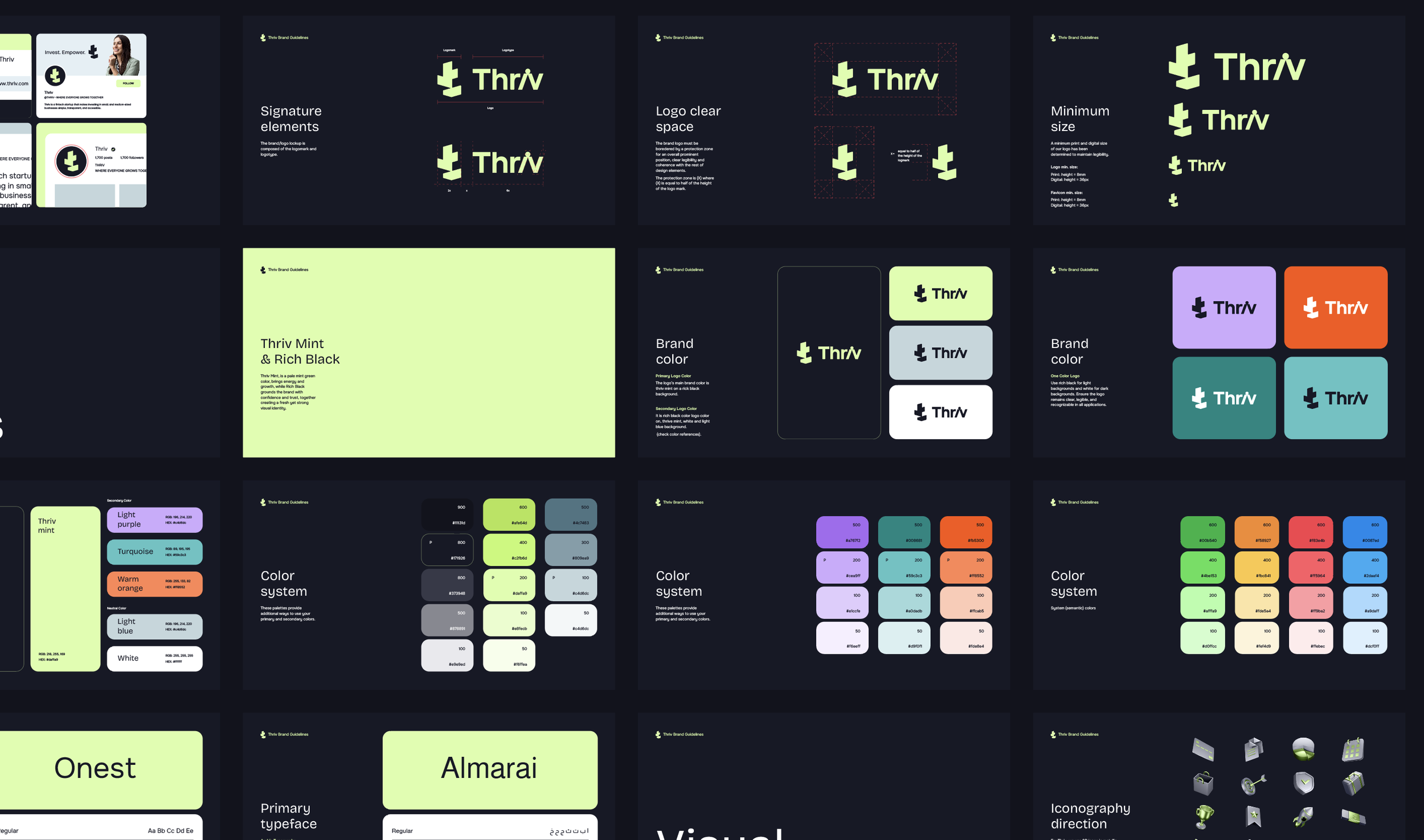
Brand Guidelines
Illustration Direction
Customized Presentation Template
UI Layout Style
01. Logo Concept
Shared Growth, Shared Trust
At Thriv, there is a belief that growth is shared among investors, businesses, and communities.
The logo reflects this idea through subtle moments of connection and balance within the design, expressing harmony, trust, and the idea of rising together.
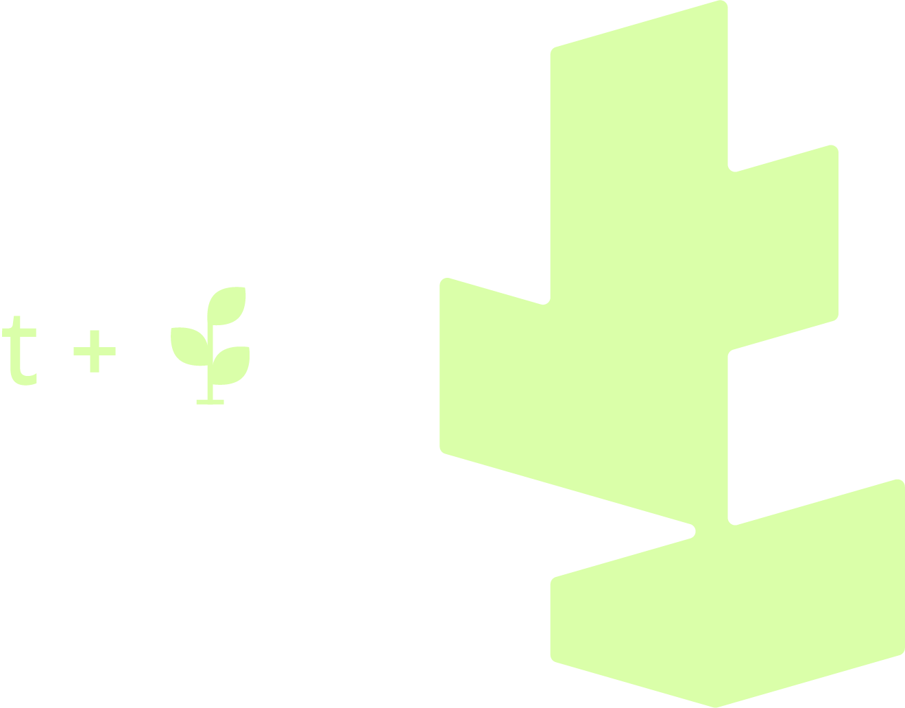
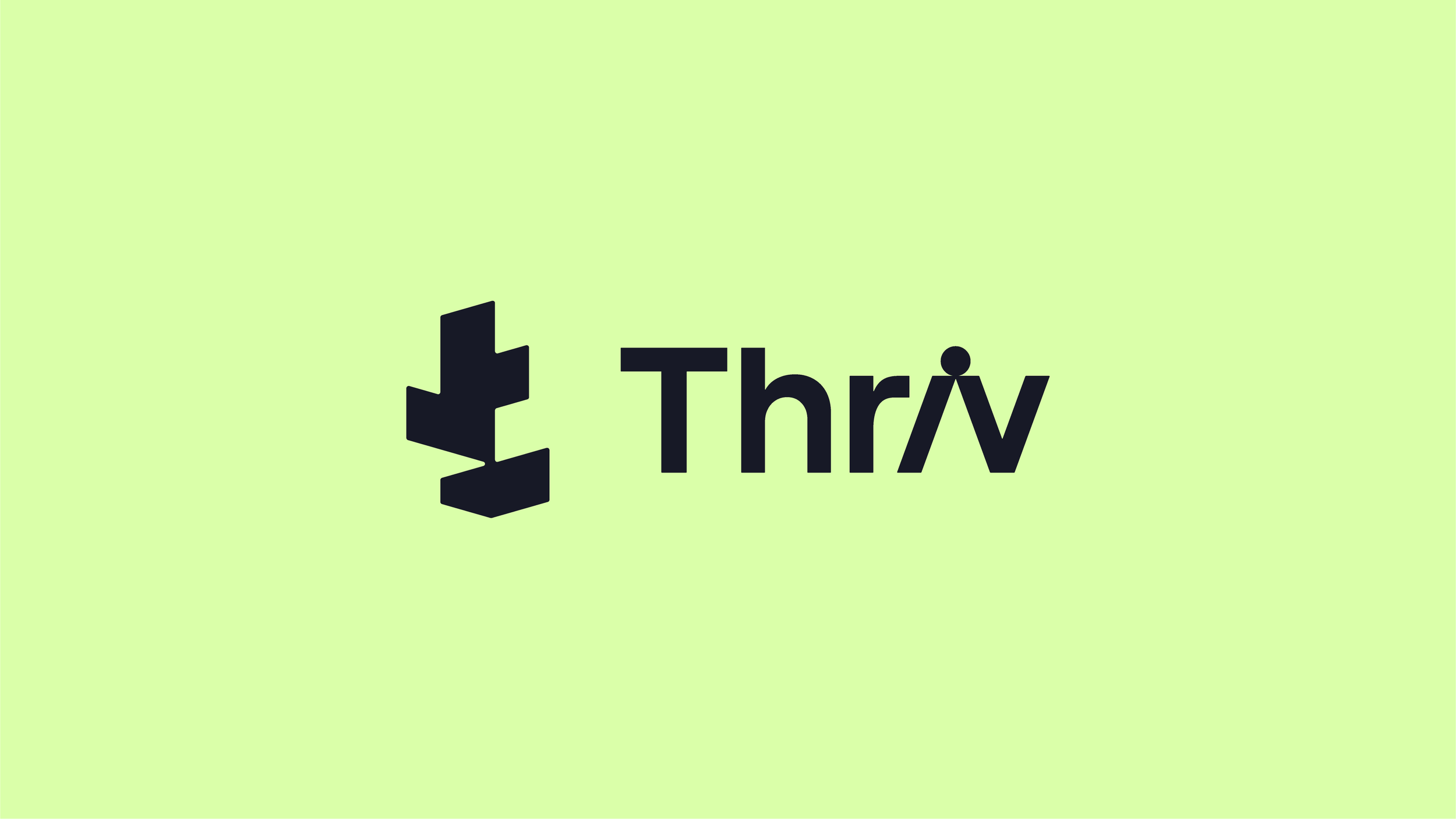
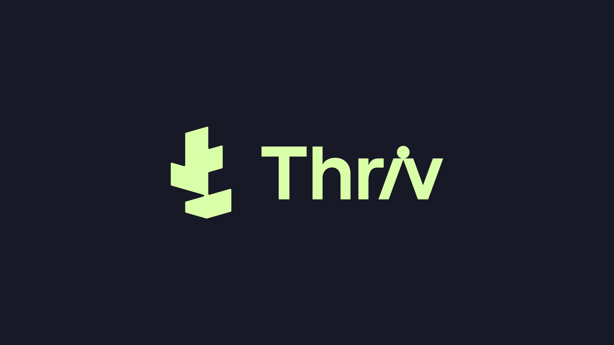
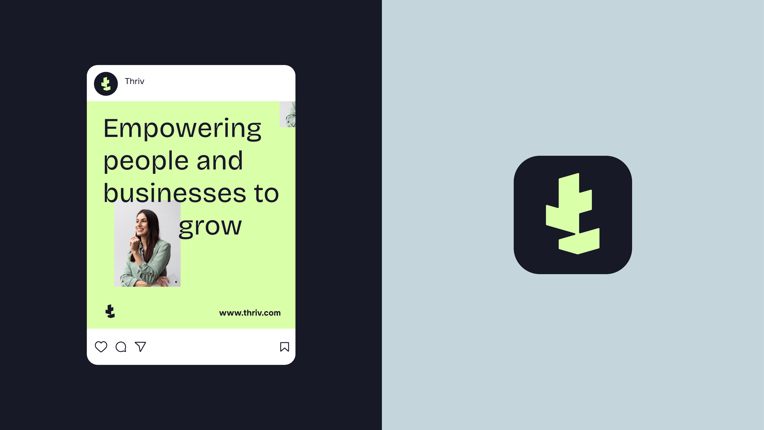
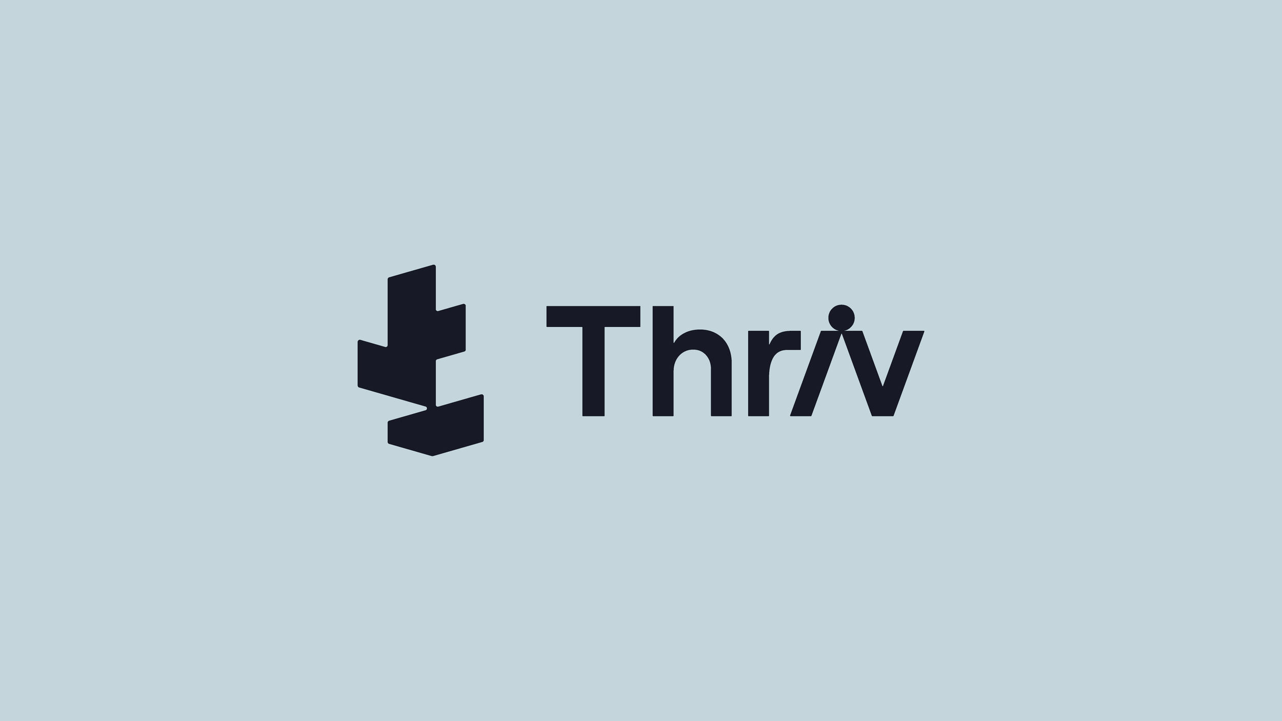
Logo mark
The logo mark resembles the stem of a plant, symbolizing growth and upward movement, while the leaves are represented through the crossbar of the “t,” reflecting renewal and continuous development.
Logo type
To express connection and support, the “i” in Thriv is inclined toward the “v,” creating a visual moment of interaction between the letters. The dot above the “i” appears to balance across both letters, reinforcing the sense of harmony and shared progress.

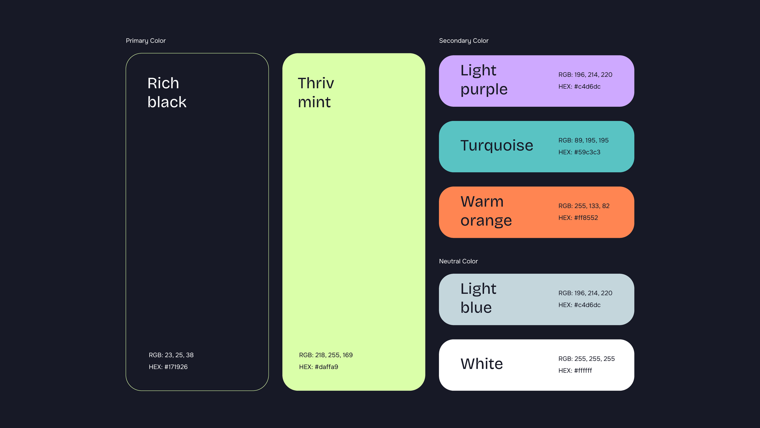
02. Brand Colors
Thriv Mint & Rich Black
Thriv Mint is our brand color. It is a soft pale mint green color, that brings energy and growth, paired with Rich Black which grounds the brand with confidence and trust, together creating a fresh yet strong visual identity.