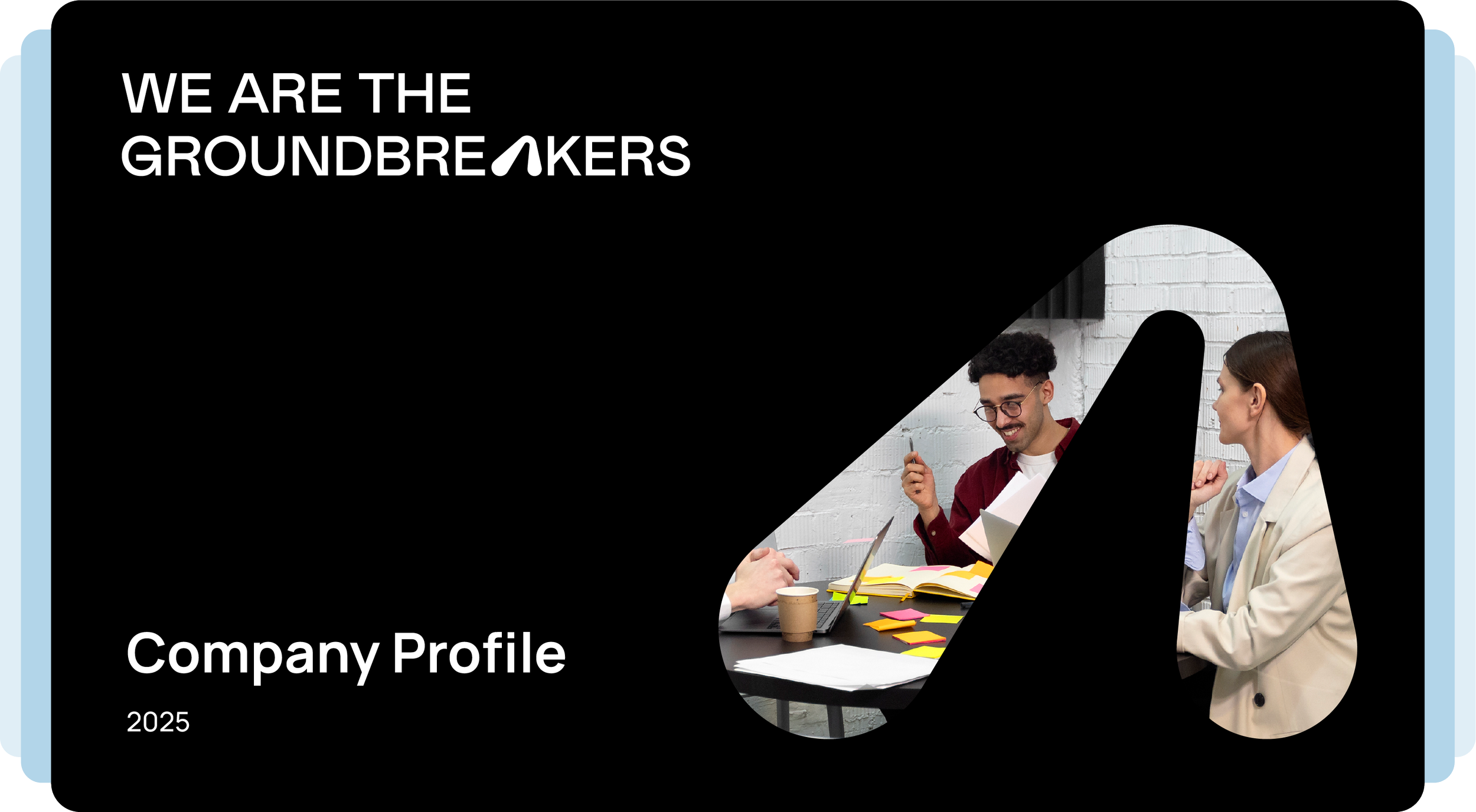
SPADE.
Digging in, Standing out


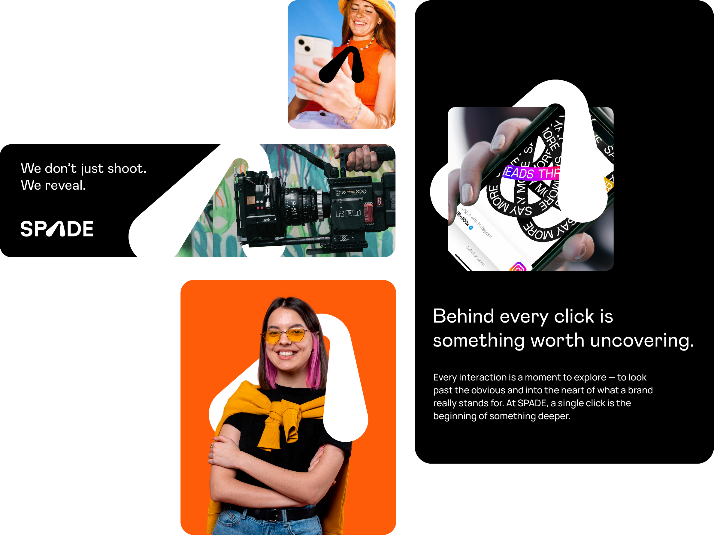
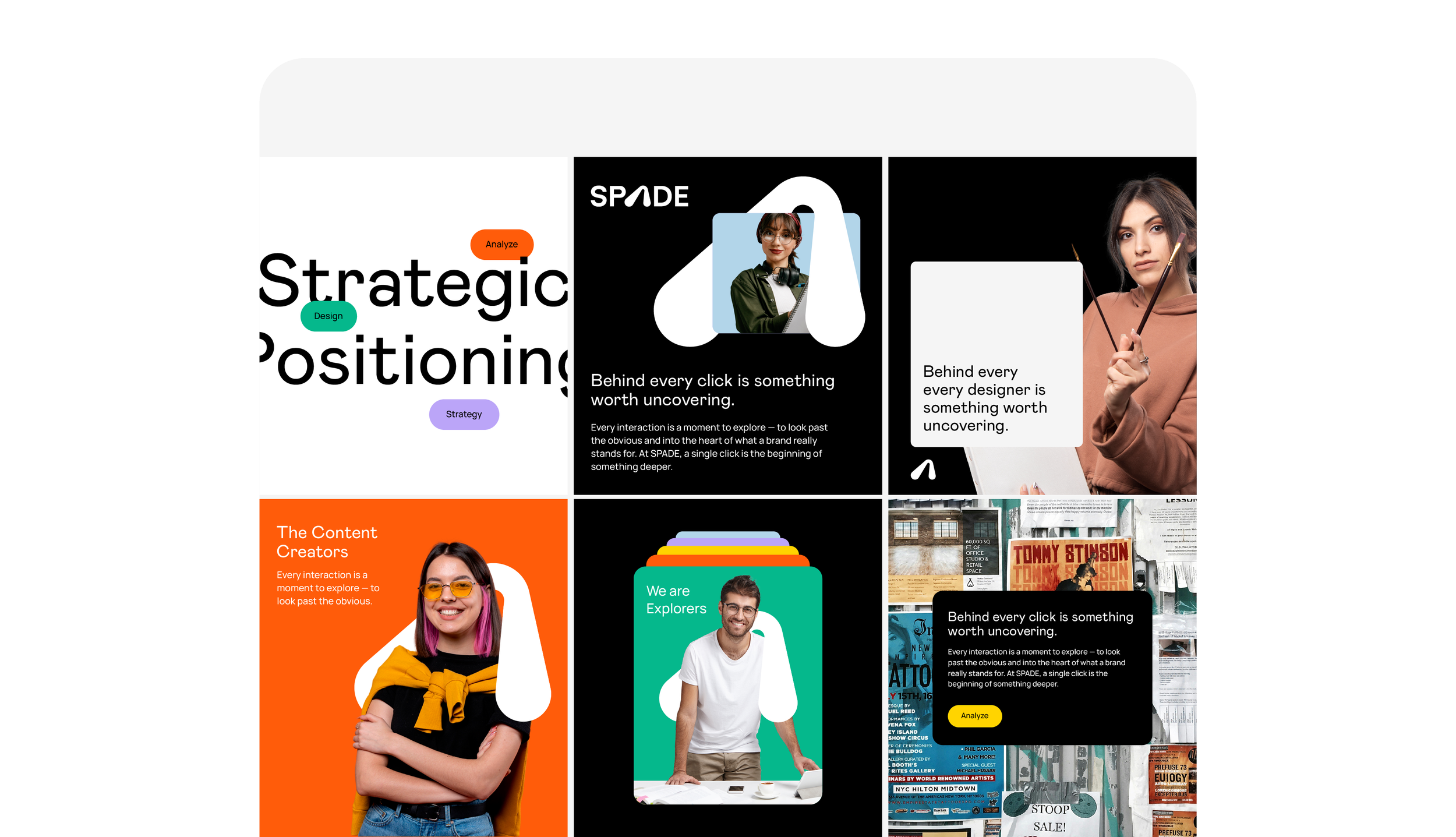
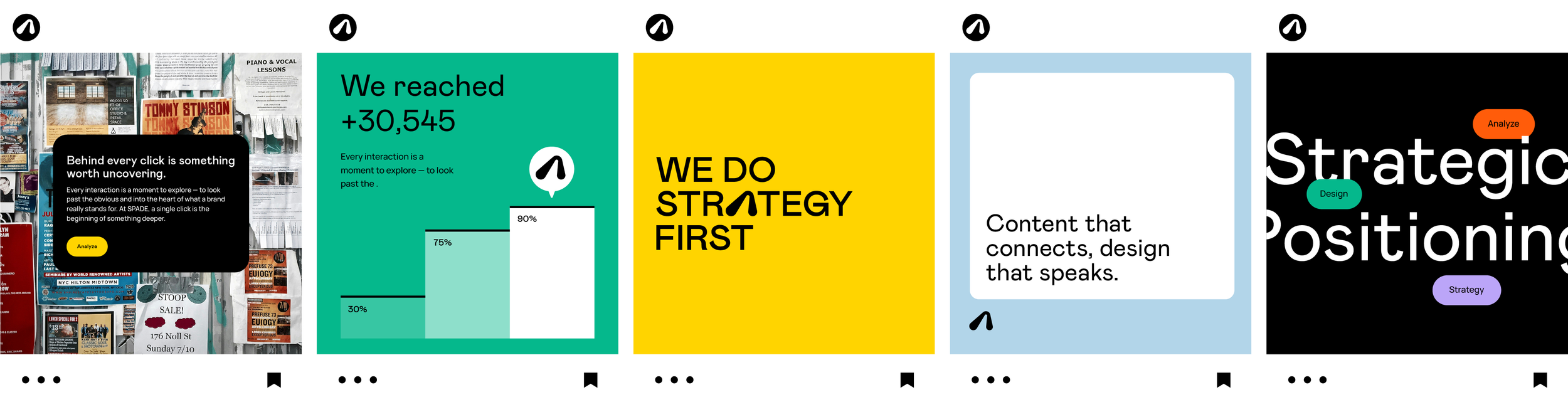
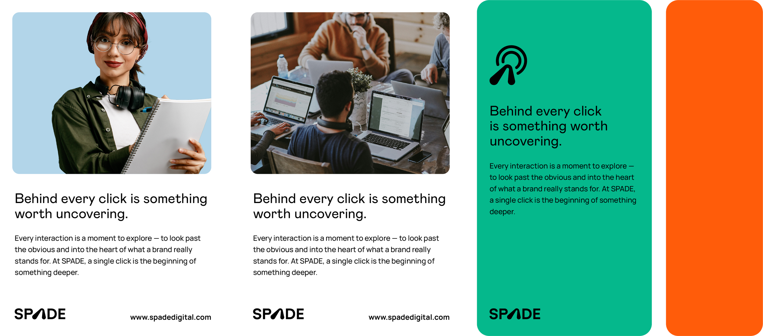
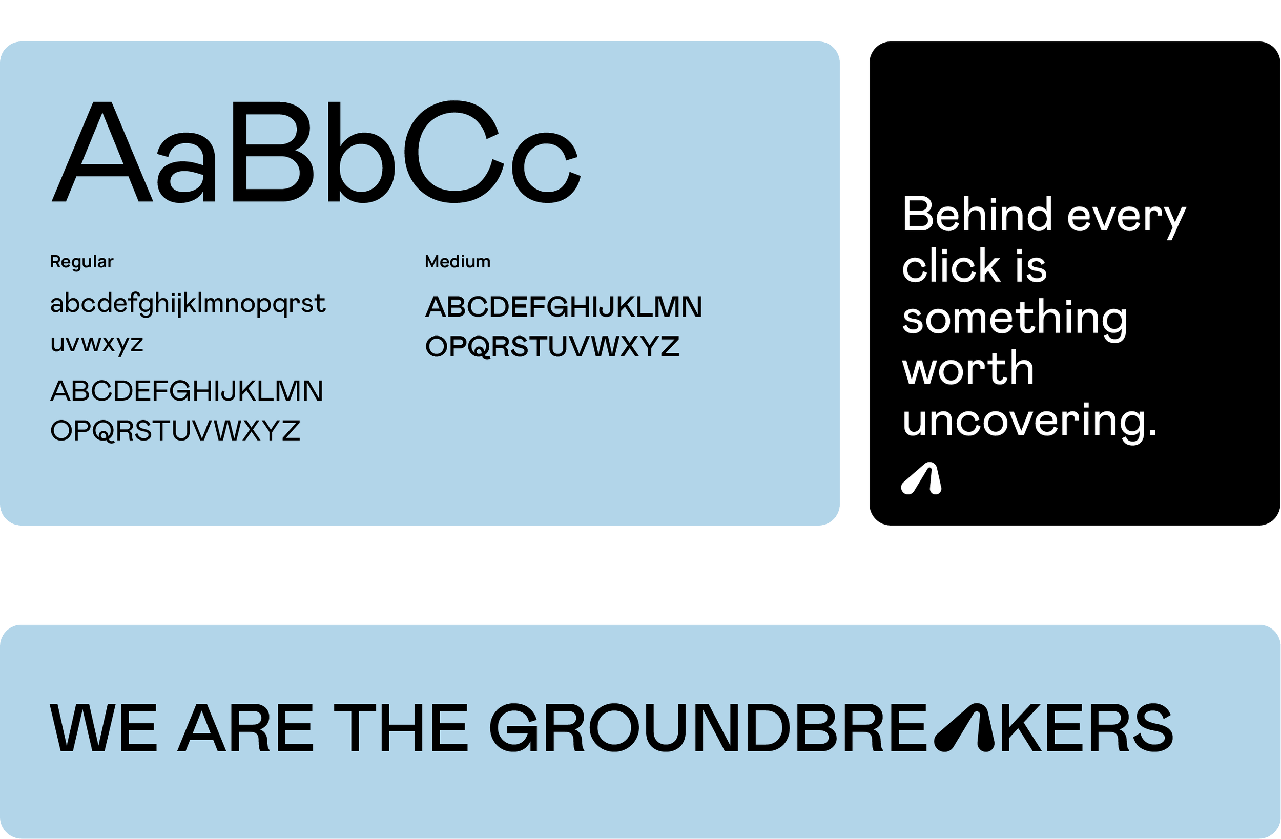
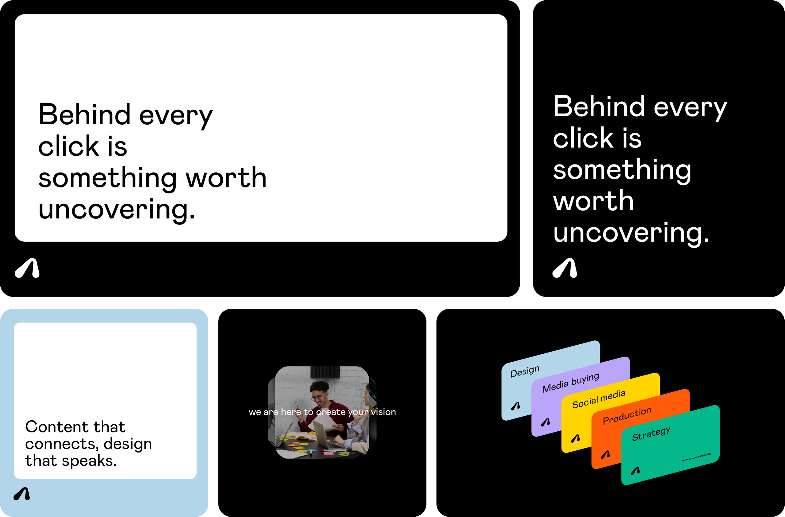
Behind every click is something worth uncovering.
Rebranding case study, and creativity unleashed, for an advertising agency dedicated to unearthing your brand's full potential.
More Than a Rebrand
The Challenge
SPADE was already an established agency, but its image felt closer to a consulting or law firm than a modern advertising agency. My challenge was to shift that perception into something more creative, contemporary, and digitally driven.
The second challenge was the name itself. SPADE was inspired by the idea of “digging deeper,” and they used the symbolism of a shovel which felt heavy and to be frank felt a lot of dirt going on.
Instead of changing the concept, I reinterpreted it through a modern lens, transforming “digging” into digital exploration. That led to the cursor ➤ becoming the core inspiration: a symbol of searching, discovering, and navigating deeper online. The result was a lighter, sharper identity that feels rooted in today’s digital culture.
My Tasks
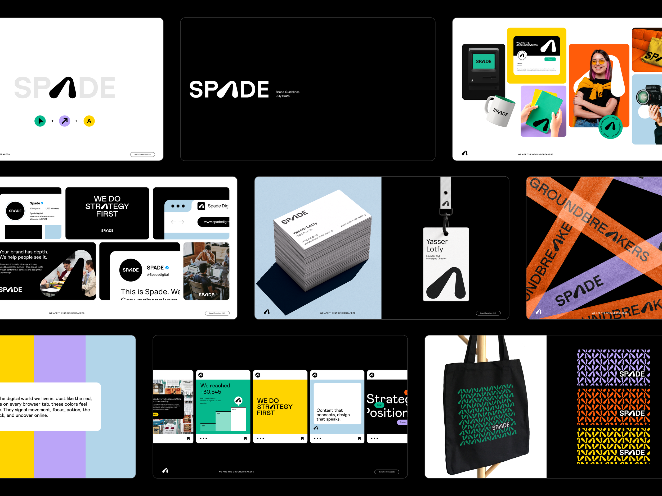
Branding Solutions
Logo ReDesign
Brand Identity Design
Brand Guidelines
Brand Collateral
Visual Direction
Customized Presentation Template
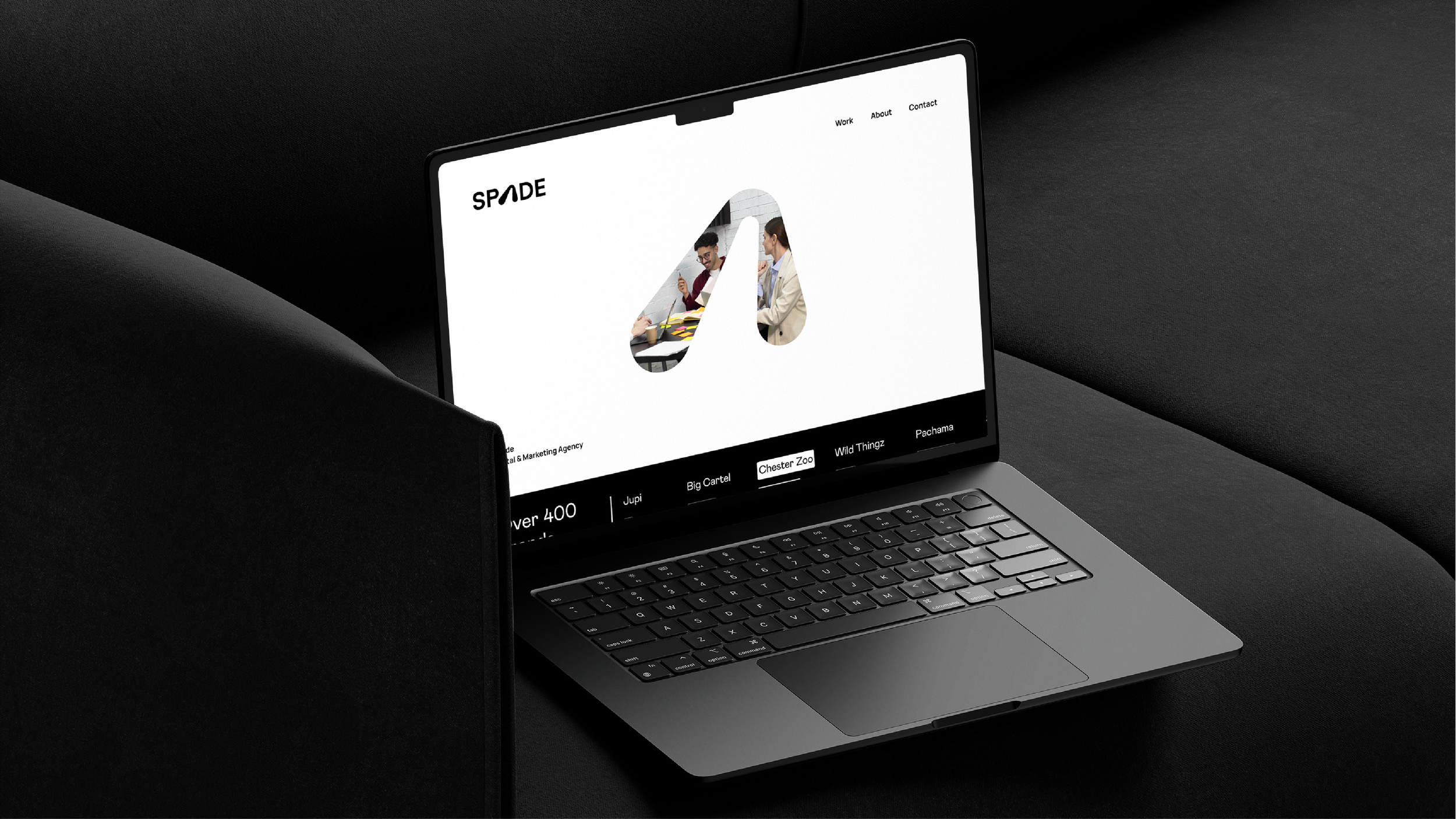
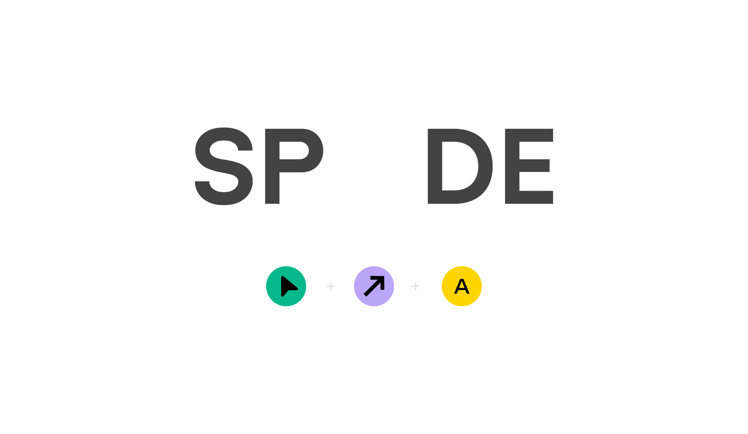
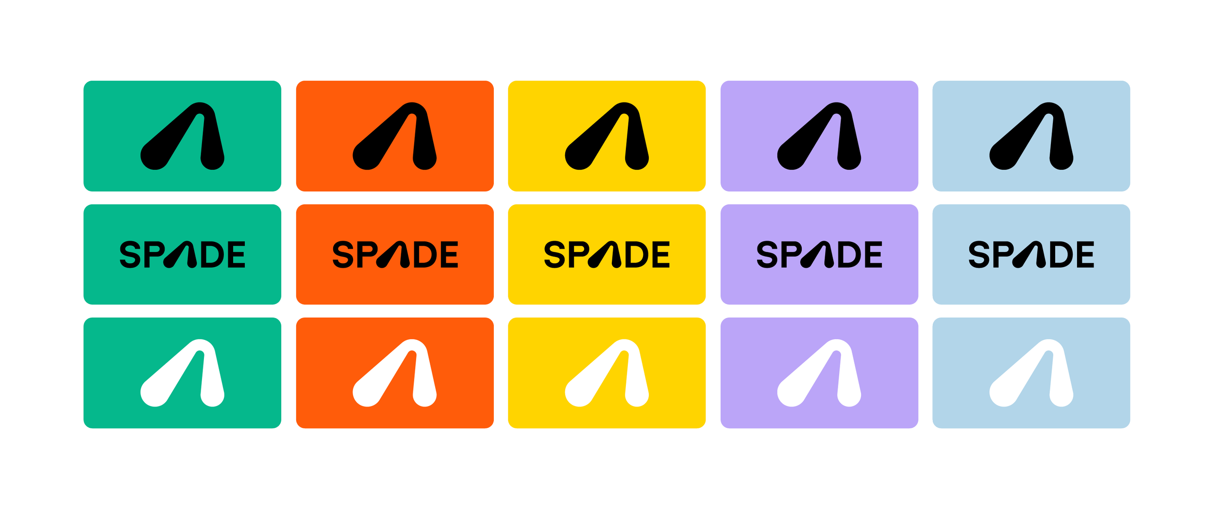
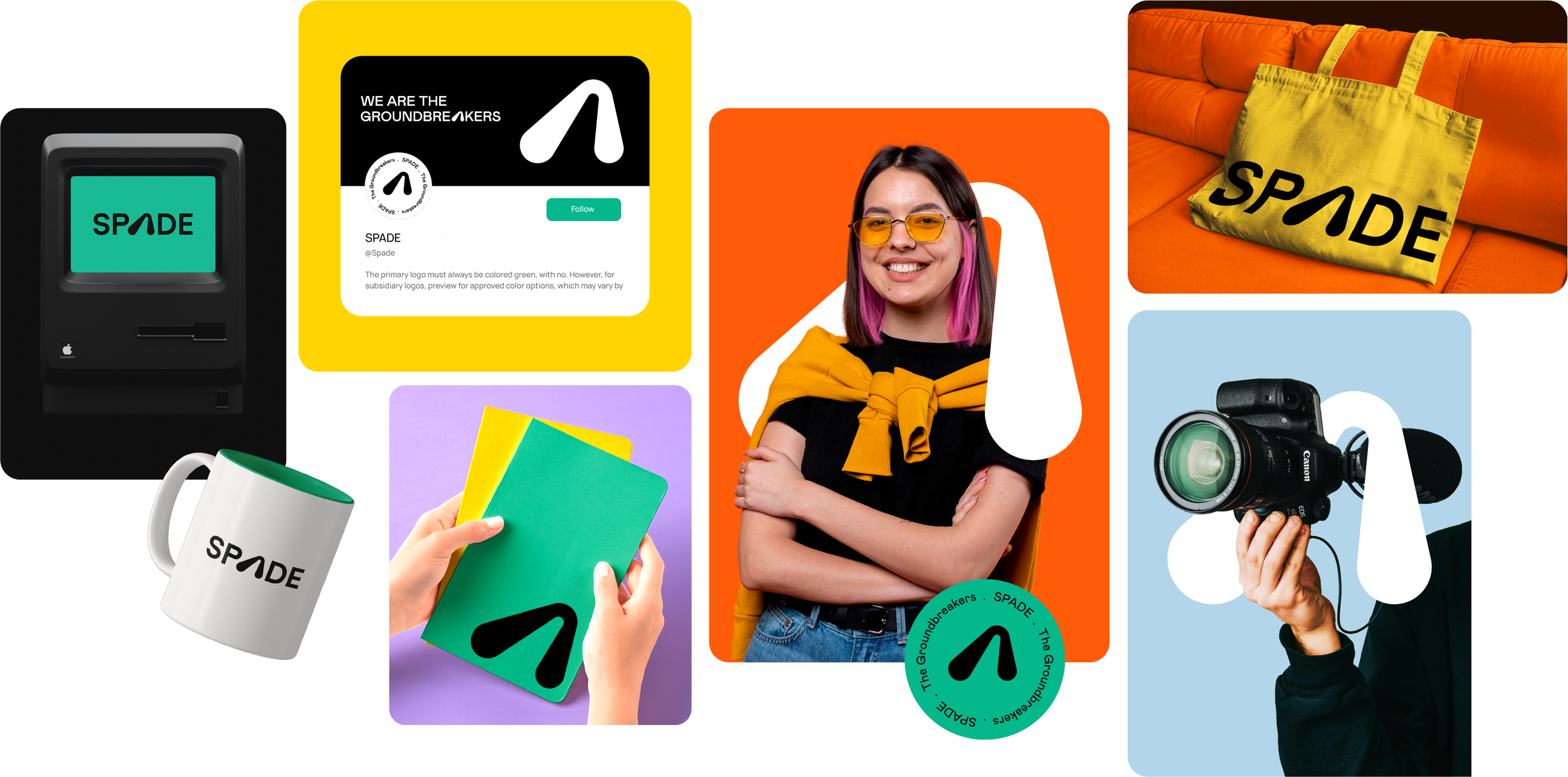
01. Logo Concept
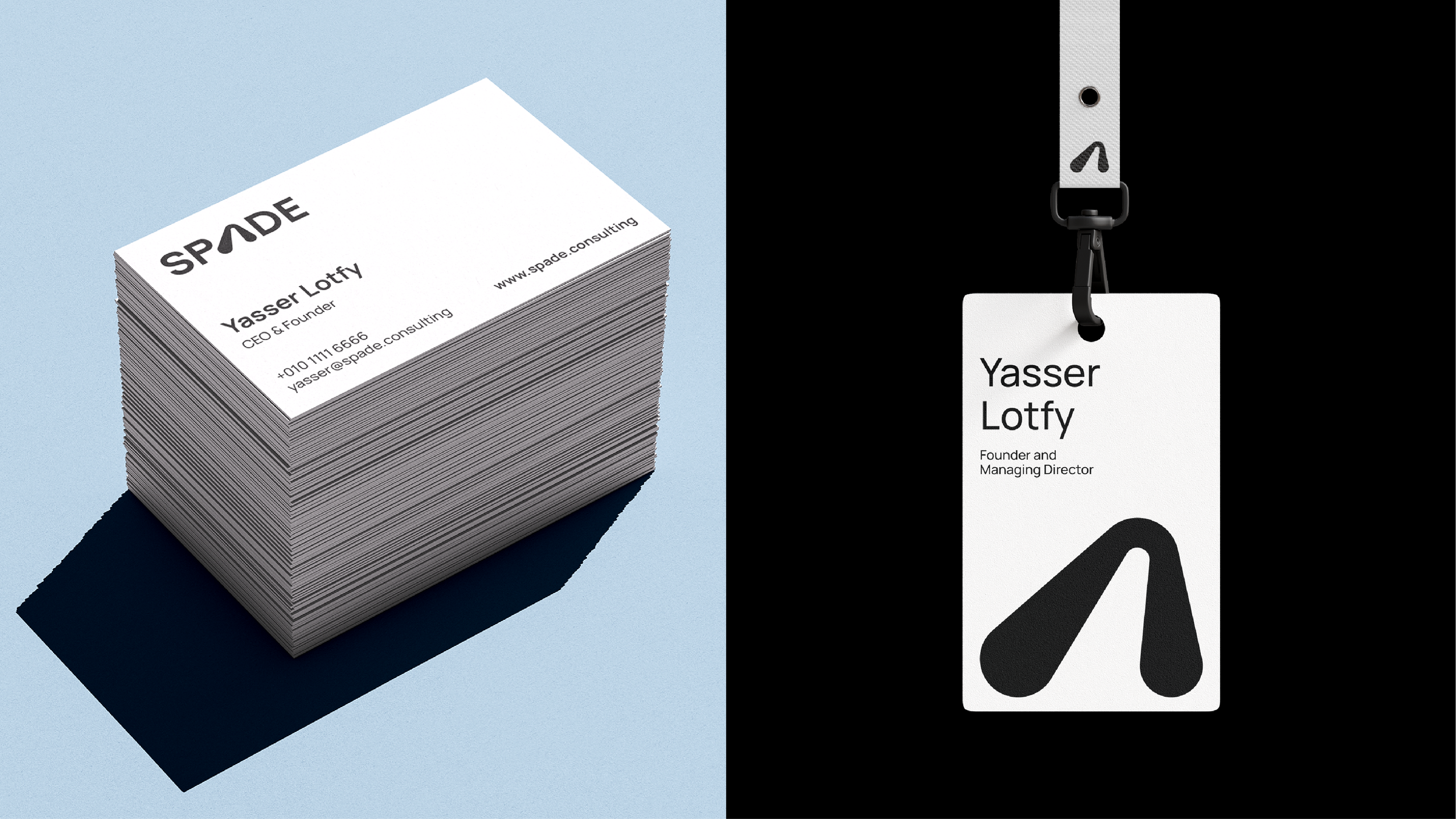
The Meaning Behind “A” in SPADE
The SPADE logotype is built on a clean, modern sans-serif base. “SP” and “DE” use a consistent, neutral geometric font to establish clarity, structure, and simplicity.
But it’s the “A” that shifts everything.
The “A” takes the shape of a cursor pointing upward and it is a subtle nod to both focus and growth. It symbolizes a moment of discovery, dig deeper, click further, and look beyond the surface.
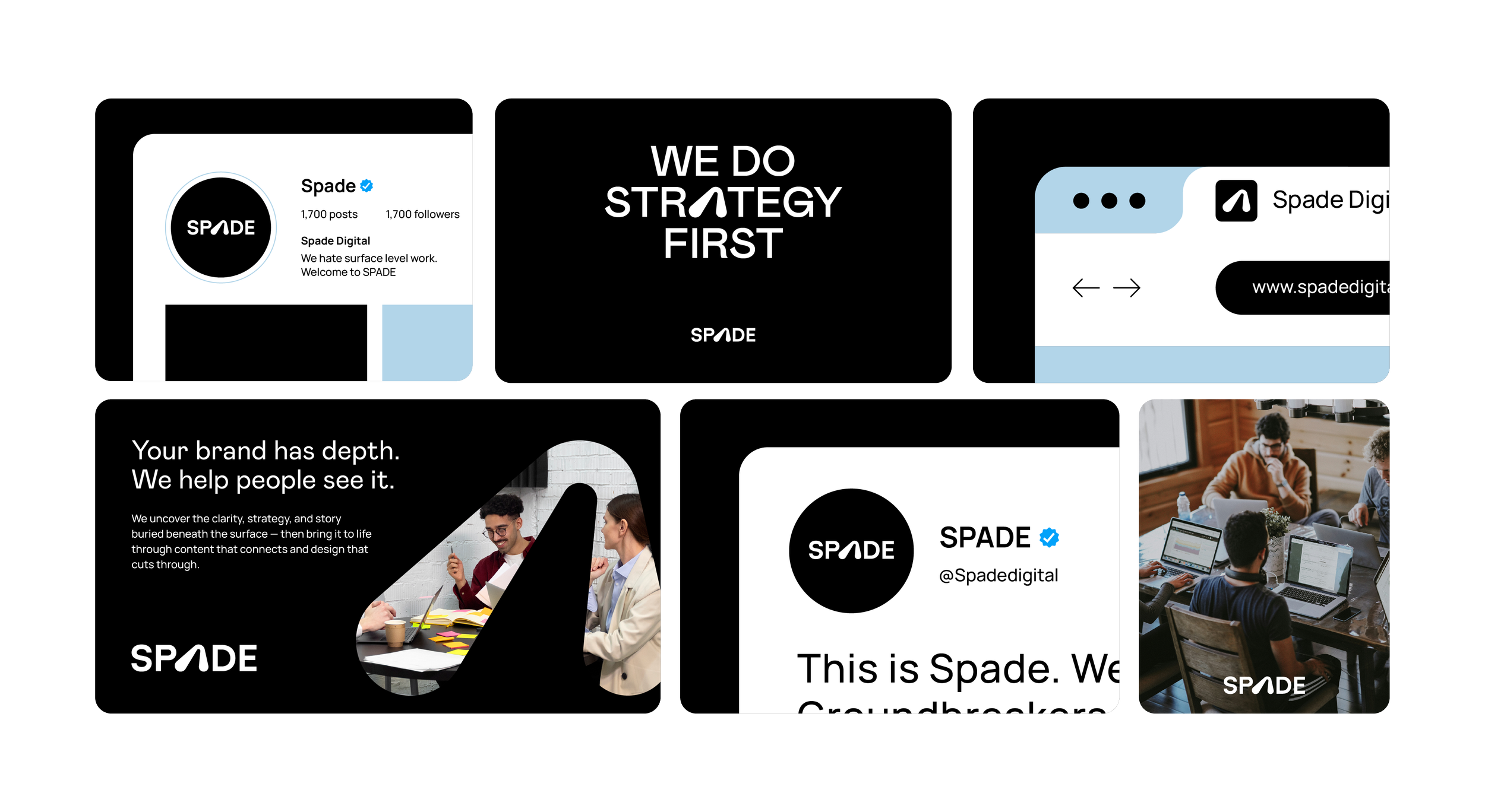
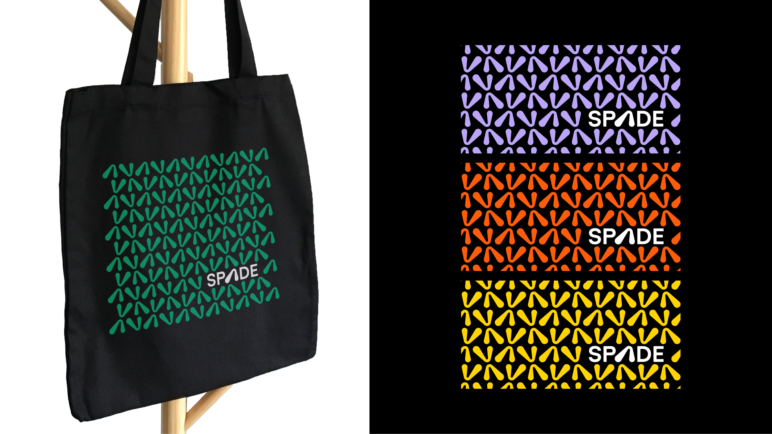
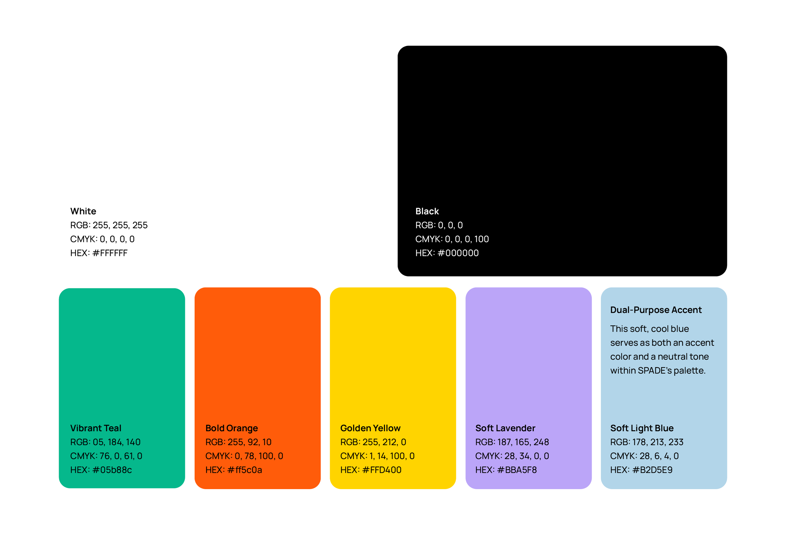
02. Brand Colors
Black & White, Powered by Accents
Our core palette is black and white, supported by a set of accent colors. These accents are inspired by the digital interface we interact with every day. Like the familiar red, yellow, and green button colors on browser tabs, they feel intuitive, functional, and alive, signaling action, focus, and momentum.

03. Typography
Mabry Pro in SPADE
Typography in SPADE’s identity is clear, modern, and confident. We use Mabry Pro to bring subtle character to our messaging with clear and contemporary vibe.
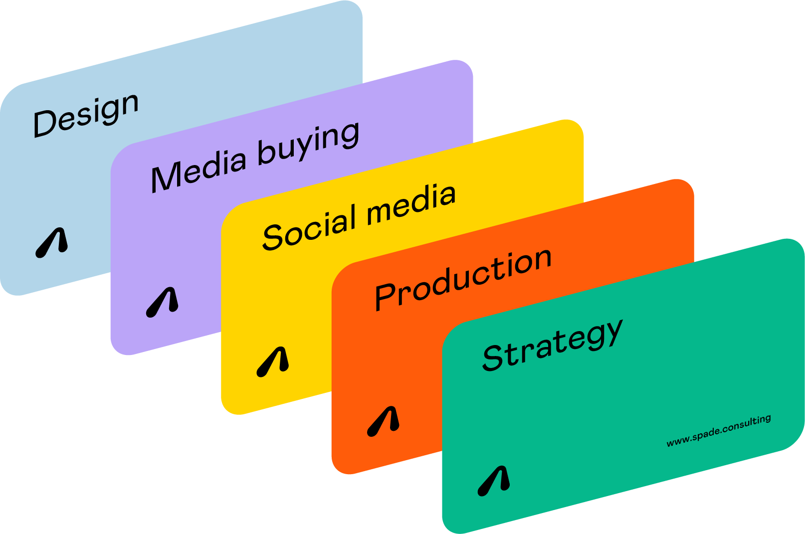
04. Visual Elements
Frame layout
Our main visual element is inspired by digital behavior — how we search, discover, and dig deeper online. We express this through stacked rectangles, layered like browser tabs or open windows, creating a sense of depth, exploration, and clarity through uncovering.